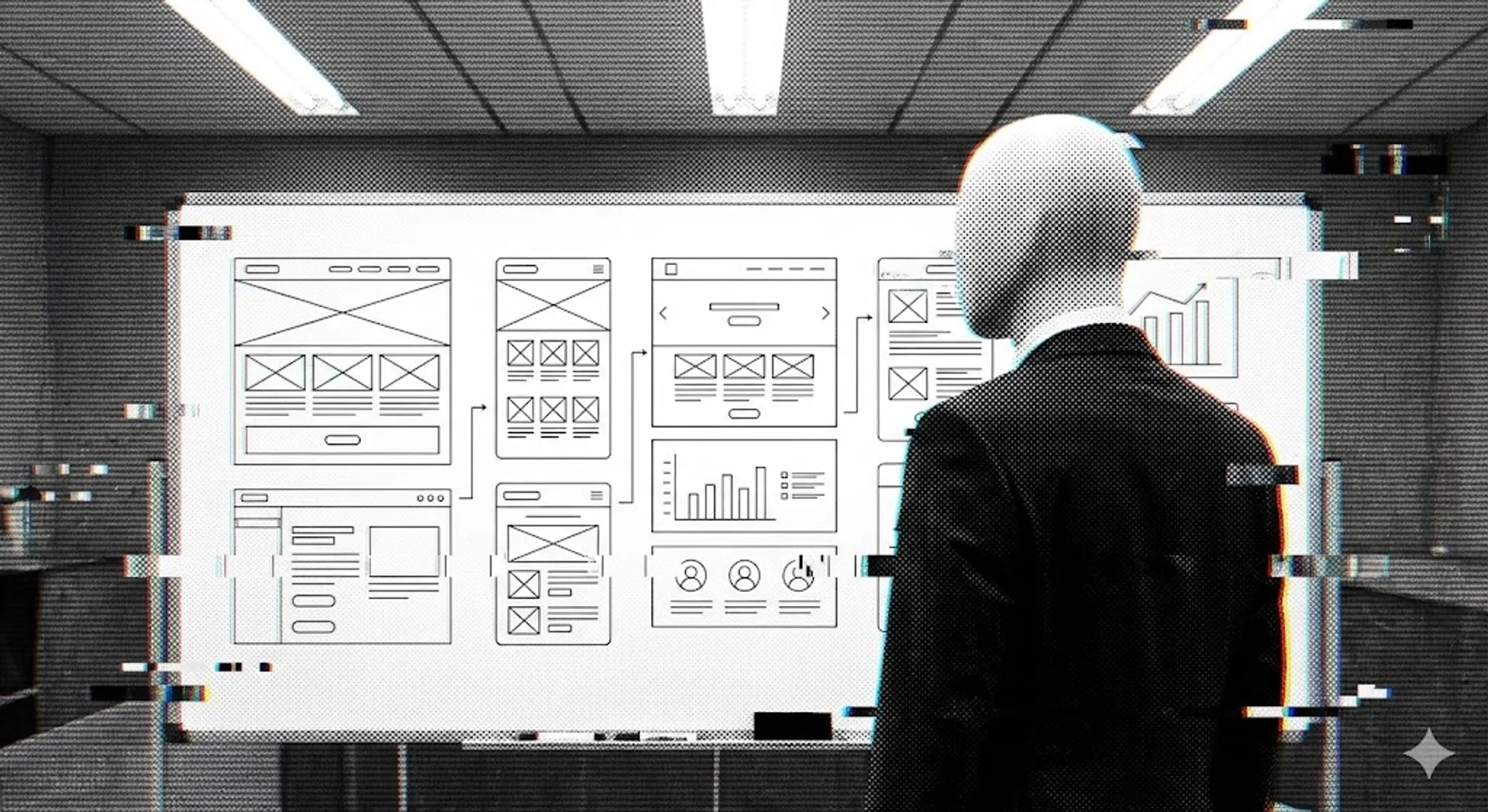
Everyone is excited about AI because it can one-shot a dashboard in seconds. Give it a prompt and you get something polished, modern, familiar. Cards. Charts. Tables. Spacing that looks right.
It feels productive. Hell, it feels like the future.
Look closer and the cracks show. Same tired dashboard. Bar graphs drowning in noise. Cards that exist because cards are what you get when nobody makes a decision. The UI gestures at insight without committing to one. And the code underneath? Tokens stacked on tokens. Spacing aliases that only make sense inside this one output. Colour roles that mean different things depending on where you look.
That is not AI failing. That is AI doing exactly what we asked.
We asked for output. Not language.
The Median Machine
This problem existed before AI touched a single pixel. AI just compressed it into something we can no longer ignore. When you feed years of so-called best practice into a single prompt, you do not get clarity. You get the median. Polished. Generic. Soulless.
The model learned from millions of dashboards that all look the same because they were all built with the same assumptions. Same utility classes. Same component libraries. Same unexamined defaults. The output is a mirror, and the reflection is uncomfortable.
We trained AI on our design debt and got mad when it repeated our mistakes back to us at machine speed.// The uncomfortable part
Take a simple example most of us live with every day. px-6 means 1.5rem. Which is 24px. Unless the base font size changed. rounded-lg is 0.5rem. Unless someone touched the config. border-gray-200 is a colour that only exists inside Tailwind’s private universe.
Every class is a number wearing a semantic costume. We say “design system” but we are still thinking in pixels. We have just buried them under indirection.
The Translation Problem
Hand the same design to a mobile developer and you get a completely different expression. Same intent. Different language. Change one value and the platforms drift. The design system becomes a suggestion. Nobody notices until someone puts the screens side by side and the conversation turns hostile.
This is the real problem AI runs into. Not that it cannot generate UI. It generates UI faster than any team alive. The problem is that we do not have a way to describe UI intent in a form that survives translation across Figma, web, and native.
AI is very good at translating language. It is terrible at guessing intent from numeric artifacts. When your design system is numbers masquerading as decisions, the model has nothing meaningful to work with.
The model sees px-6 and produces px-6. It does not know why that value exists. It does not know if the padding serves a reading rhythm, a touch target, or a visual grouping. The number carries no intent. So the output carries no intent either.
Intent as Language
We do not need more tokens. We do not need another framework. We need a shared design vocabulary.
A way to describe design in words that mean one thing everywhere. Words that map deterministically to tokens and then to platforms. Not pixels. Not utilities. Intent.
“Chrome outline card. Padding large. Radius large. Vertical stack. Gap medium. Primary solid button. Destructive ghost button.”
Every term maps to a single decision. Colour role. Emphasis. Scale. Structure. No ambiguity. No platform bias. That sentence can be spoken over a Figma file, written in JSX, or translated into XAML. The sentence is the spec. Tokens and implementations become mechanical.
This is where AI actually becomes useful. Not as a layout engine, but as a translator. Give it intent in a vocabulary that means something, and the output stops being decoration. It starts being design. The model does not need to guess what you meant by gap-4 if you told it “medium spacing between related elements in a vertical reading flow.”
Before you prompt AI for a dashboard, write the design brief in plain language first. Describe the decisions: what gets emphasis, what recedes, what the user should do next. If you cannot describe it without referencing a class name, you do not have a design system. You have a stylesheet.
The Lie We Settled For
Design systems are not broken. They are lying. They promise semantic meaning and deliver numeric indirection. They promise cross-platform consistency and deliver per-platform drift. They promise a shared language and deliver a shared syntax that everyone interprets differently.
AI did not create this problem. It scaled it. Every hollow dashboard, every decorative card layout, every chart that exists because a chart was requested: these are symptoms of a vocabulary that never existed. We papered over the gap with conventions and hoped nobody would notice.
The model noticed. It repeated our emptiness back to us, pixel perfect, in under four seconds.
So the work is not better prompts. The work is better words. A language that describes design once and lets tokens and platforms do their job underneath. Get that right and AI stops decorating.
It starts designing.
// SENSOR_DATA_OVERLAY: FIELD_INTENSITY 0.92Hz
// "The design isn't just a shell; it's a sensory interface for the model's weights."